Tuesday, August 30, 2011

Paris Pg 2 and a clean scraproom

All the surfaces in my scraproom are tidy. This isn't a good sign. I don't really tidy up between pages. Well, I do, most things get put away, but this is tidier than normal. Getting ready to head to PA for a couple of days for a team event. We get together as a team in real life every three to four months, eat cake (and lunch) down by Reading, PA. Ah work!

Interestingly enough, my bff is meeting me tonight and we are doing a scrap page together. Well, I've made her a kit. I think she needs a page of layers. Poor thing. I have packed my hot glue gun. We are also using a sketch (see the one below), but mostly because I think she'll enjoy it...and it's a great sketch. One thing I love about the blogging community is the free free free aspect!

And I have tucked in a few goodies from a package sent to me from Helen, who ROCKS!! Oh my, the fun I had ripping it open. So from far away a few scrapooking goodies will come to rest on a page I am sharing. It's just all good.

I did bring my camera but normally these trips leave me drained, so not going to promise much blogging from the road. Might be too much cake...that could be my problem.

I did want to share a quick page with you.

This is the second page of a two page layout my friend Marilyn made for me.

I blogged about it earlier. Can't find it to link it here. I have made a new resolution to myself. Only use titles that describe the post. Yeah, don't hold me to it. Prob not going to really happen, but it's a nice thought.

So, this page was finally completed the other day. I had spent a few days with my aunt from Cali in Lake George NY and asked her nicely to write my journalling. When I was in highschool, I spent a summer in Paris with my Aunt and Uncle. The photos weren't amazing, but printed smaller, not so bad. I liked hearing the story from her aspect. I think if you want to give reading the journalling a whirl, you can just click on the page and it will enlarge. So, it's neat to have her handwriting, my addition which was the two little frames on the side, and then Marilyn's base scrapbooking to enjoy. It's kinda what scrappin' is all about. Plus, both sisters (My Mom and her) poured over my Mom's album from Paris, so that was very cool too. 

See ya in a few days!

Monday, August 29, 2011

CCG Challenge Page 206


Oh my the colors they picked this time round were AMAZING! I really enjoyed this challenge. The photo on this page is just set in there. I am still waiting for a photo from a friend who recently got married in a lovely vintage type gown which actually should match these colors nicely. So, I expect maybe she'll also want to add some journalling too in her own hand. This should make a nice little framed page for her wall.

Each little item I placed in my flower cluster have meaning. As part of the challenge they asked that we use a piece of wood. I used a grapevine and also the little dress form (yet more of Tink's stash). The little best friends heart is also out of wood. The dress form symbolizes the special dress my friend's hubby purchased for her for their special day. The Best Friends wood piece describes words she used to describe their relationship. The little white sparkle angel wings are also a symbol that are special to her. Of course, I also used a vintage handkerchief I had cut in half as the other half was damaged (something old?) and the hat pins are not only fun, but I used a really old crystal on one of them. I was going for the old look. The title is also something she used to refer to her hubby.

The items I used on this page are as follows: 

  • Quick Quotes Ribbon (white & black stripe) from Tink's Stash
  • Anna Griffin Clear Paper
  • Stampin' Up White Ribbon
  • Black Close to My Heart sandable paper
  • Vintage Lace Hankie
  • Vintage crystal bead
  • stick pins
  • tattered leather glimmermist

Sunday, August 28, 2011

But I didn't pack for Irene!


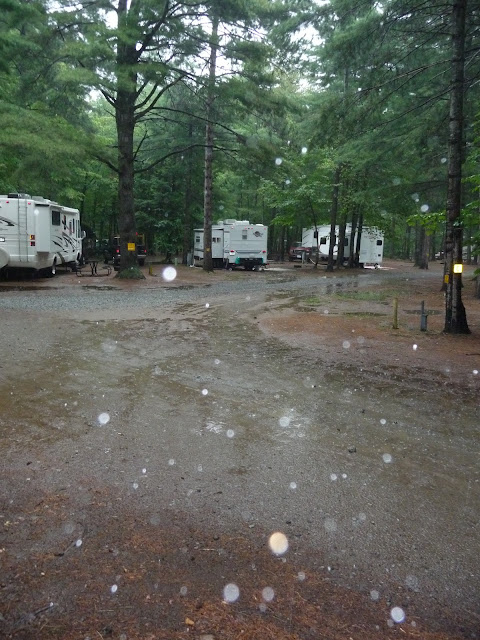
We spent the weekend at the KOA in Lake Placid. It went so quick! Of course today wasn't much fun. We knew we'd be packing in the rain. We are pretty much only getting rain from the Tropical Storm Miss Irene, formerly a Hurricane. Thankfully we are so far north that most of the wind missed us as well. However, it did make for a quick pack job. Poor Hubby was SOAKED! As he attempted to dry off in the truck on the way back home he mused....how could we have done this quicker or better so I didn't get totally wet! And, I said, well, we could have at least an extra shirt for you in the truck...at which point, he said, well, I didn't PACK for Irene! I only had enough clothes left for today!

I found this year I didn't take as many photos of the campground as I had last year. I have a ton of pages I made from our weekend trip last year. I wanted to share a page I made last year. This photo was taken along the Ausable River, a short walk from where our camper was. Most of the products on this page were from Close to My Heart. I did use real birch bark! One thing a dye cutter is good at! I did really notice when I opened my scrapbook from last year how much different my style is or even how much THINNER!

I think it's the result of blogging around and seeing other work you LOVE! Back a year ago I spent time looking a magazines and catalogs that are US based. I still love to look around at those, but I love the content I can get on my ipod in the evenings sitting on my couch. It's always fresh and not a few month old! Not to mention, real live people blogging about real live things not just their perfect life on their pages!

So, I challenge you to grab a page from a year ago and see if your style is the same!

Thursday, August 25, 2011

oh Goodness!

It was one of those days today. As you all might remember, I work at home. And somedays despite my best efforts, it still is well....WORK!

I am back at it a bit, the 100 plus e-mails need filed before tomorrow, but at least I had some time to take a break in between it all. I did consider at one point hiding under my desk mid-day, but I would have had to ask the dog to leave that spot and I am pretty sure it would have been a fight!

Now, I did want to share a card and a little Mitra-ism. Well, normally it's Lisa that has the stellar advice. Mine isn't nearly as funny. Mine is regarding "hater" e-mails. You know the kind. The one that if the person writing the scud e-mail would have just picked up the darn phone and asked questions IN PERSON, they would have understood that they misread the situation. Anyhow, meeting at 10 tomorrow to disect the entire e-mail, which just goes to show you how much time a bad e-mail can waste. So, don't be a hater, pick up the phone already!

So, anyway, on to my card! This is mostly made from recycled stuff. The back ground with flowers was Bo Bunny packaging and the pretty scallopy die was made out of cardboard!  I do LOVE my flower! Saw a dandy ribbon tut out on Yvonne's More with Less blog, which I copied but with smaller ribbon and some that was already crinkly. Fun little butterfly came all the way from Tink's private stash, yahoo!

And, since today is my Friday (sorta, still have that 10 am mtg tomorrow) and we're heading off for big adventures, I thought I'd share my next project! Found this lamp recently at North Country Neighbors. To be exact, some dude was carrying it in to sell in his wife's stall and I was like, HEY WHAT DO YOU HAVE THERE and scared the crap outta him. I think he thought I was hitting on him, but no, I really just wanted the lamp!


Tuesday, August 23, 2011

Our House Scrap Page for Once Upon A Sketch


Was flipping through Picasa today trying to decide what was next when I came across this photo.
You will want to click on it to enlarge. It's the backside of my house, coming from our woods and the sun happened to be setting when my Sis in Law grabbed a photo. Immediately my mind flashed to one of my favorite songs of all time by Crosby Stills Nash and Young, Our House.


Very good song. Something played often in my house growing up.

I'll light the fire, you place the flowers in the vase that you bought today. Staring at the fire for hours and hours while I listen to you Play your love songs all night long for me, only for me. Come to me now and rest your head for just five minutes, everything is good. Such a cozy room, the windows are illuminated by the Evening sunshine through them, fiery gems for you, only for you. Our house is a very, very fine house with two cats in the yard, life used to be so hard, Now everything is easy cause of you, ooo, wah, la, la, la...Our house is a very, very fine house with two cats in the yard, life used to be so hard, Now everything is easy cause of you, ooo, wah I'll light the fire, you place the flowers in the vase that you bought today

I also thought that NOW I can play along with Once Upon A.....Sketch which is always a goal of mine at least once a month.

Pulled out some paper and BLAH! It had to be something special. Lime Green is one of my daughter's favorite colors (and why not, it's amazing!) so when I spotted this new piece I had bought recently from Bo Bunny (double dot) I thought, we might just have a winner! Now I must admit, my fancy circle piece is um...the cardboard from the back of a paper pack...and glimmered up pretty with a stencil from Tattered Angels. Of course I had to use some vellum "lace" for the edges and a Purple Pumpkin button with the edges darked with ink and placed in a bottle cap!


I am also not yet sick of my new Tim Holtz rosette die and made a flower from paper still hanging around from making Shirley's boxes.


The Tink sent me this cool butterfly! Which of course pushed the lime greeny paper! And that fab material in the background that is very sheer! If you take a look above, I also tucked some under my rosette! (and on a side note, her package arrived and was inspected by my crack postal inspection team, both kids wanted to know WHAT COUNTRY the package was from due to the pretty seal on the front of it...)


I included the original pic I started with in this post also because I wanted to talk about using "special" photos for a minute. I think a photo with some cool edits can only enhance a page. Now, this one I added the lens flare in photoshop and also some of the lyrics. Also, lightened it up a bit! The words on a photo can easily be added in Picassa which is not only free, but also a wonderful easy to use program for editing photos. Give it a whirl!


Big Girl Panties


So, recently got to enjoy another Lisa-ism. We were out and about and while I was complaining about something, she told me to get my BIG GIRL PANTIES out and get moving. It was a good thing to say to me. Although I detest being scared, I do like to compain a bit, which in turn holds me back.

I think on top of her daily goal to have fun, wearing big girl panties daily are another good thing to do. Now, the last project I made for her involved reminding her to have fun. Somehow I don't think I need to remind her to wear her big girl panties. It's a state of mind with her. Now, to get that same attitude into my brain!


I did make a card for another friend's birthday I'd like to share. Rhonda is in my exercise class. I thought that this Paris card along with the Skinny Cow ice cream I brought to class would make her happy. I wrote Potsdam sounds a lot like Paris in the card. Now that is another state of mind I am attemping to cultivate! I love my flower cluster!!!


Well, have a great day and WEAR YOUR BIG GIRL PANTIES and make sure you get some fun into today!


Monday, August 22, 2011

Our Wedding Day and Color Combo's Galore Challenge 205


I LOVE this challenge blog! So very sweet!! Very inspiring..


Pulled this photo out of my little box of odd photos. I don't think I even used it in my wedding album. I have been working on a scrapbook using older photos. They are so much fun for walking down memory lane. I am not making a huge book, but some highlights. Just fun stuff.


Anyhow, they were also asking that "mesh" be used on this page. I didn't have any. I had to go out and beg some window screen off the hubby! I tried to spray it up with paint and glimmermist, but didn't get the nice coral color I wanted. But, I do like the contrast, texture, and also how it looked when I tore it just a little!!


My other favorite part of this page was making the paper lace that runs down the edge. Not to mention the misting with the stencil. Most of all though, it's fun trying to find bits and pieces that match the colors for the challenge and the photo!


Come play along!


And for those of you that follow my blog and have left me all sorts of nice comments out there, you ROCK! Way to make a girl feel like a queen!


Supplies:
Peachy Colored Paper: American Crafts, Love (All You Need)

Window Screen

Cardboard Scallops: Close to My Heart

Flower: handmade from Thailand

Flower & Dot Paper: Wild Saffron K & Co.

Vellum Quotes: K & Co.

Letters: Webster's Pages

Paper Butterflies: Close to My Heart

Cream Colored Ribbon: Stampin' Up

My Mind's Eye Stella and Rose Decorative Brads

Dragon Fly Glimmermist and Stencil

Bo Bunny Cabochon


oh Shirley!


What was she thinking? She skyped me the other day and said, I found two wooden boxes for US to decorate. (note the key word there, "US") So, I sent Kid Post over (as in, my son ran over to grab them from her and save us the walk) as I told her I'd get the base layer of white on this weekend. In fact, I didn't even take a before photo. They were terrible. One had red, white and, blue while the other had a hand painted poinsettia which was also nasty. So, grabbed my gesso which is a good cure all. I painted both tops white and left quite a bit of the texture. I opted to spray the sides with glimmermist and also use some of the color that was there to show through. Used StayzOn to grunge things up a bit!


Now, these boxes were so pretty without decorations! I wasn't sure if she wanted to use these as boxes for a present or to store items in her craft room. But, that didn't stop me! The hubby had wandered up at some point and I whipped out a brush, glimmer modge podge, and the hot glue gun. Before I knew it, they were done!!! She left me alone with our project, see what happens?


Friday, August 19, 2011

First Jobs and Playing along at another freaking scrappy challenge!


Seriously fun! That is what this challenge is! Give it a whirl! They want you to scrapbook FUN! Which is, fun! So double fun. Kinda like having a candy bar with your bowl of ice cream. I married the sketch to the another challenge at Color Combo's Galore which seems to be a new addiction of mine. I like how just a few colors really make me focus.

I also don't have the option of running out for new paper either really, so it makes me really stretch my brain to make things work. For instance, that lovely blue in the CCGC I recognized as paper I once had, but then couldn't put my hands on any of it but just a couple of pieces. Clearly, I needed more blue! So, I grabbed some white roses, inked them up, and then sprayed them with clear glimmermist to get the ink to flow, and thankfully they look very pretty now! The gauze was the same deal, I wanted to include the clouds on the sketch, but they didn't really fit, so I opted to use the sprayed gauze look. I have actually now switched over to using cheese cloth, which is fun too.


The newspaper flowers are some I just made with my new Tim Holtz die that I LOVE! It's pretty awesome! The flowers in the center are new ones recently released by Close to My Heart. Pretty, but I wish they had more than just a few colors!


Part of the CCGC is that you use a grid like pattern. That said grid paper to me. I love grid paper. I had it around due to sketching something out recently, so it was simply a matter of tearing off a sheet and printing off my journalling on it. Check out my journalling below.


I am working on a scrapbook of childhood memories and since a friend reminded me about a past job I had, I spent some time thinking about jobs in particular. Hence, this page! Plus, I kinda think my dog photo is fun!


The letters I used on the bottom are new cork ones out from Close to My Heart. They are pretty cool, but I can see some future inking on them! Loved the brad I added, that was about how much I made back then!

So, what was your best job? Anything fun? Isn't funny on how some of the similar things you've done in your life may have been the most rewarding? I love my job these days, but it's far from simple!


Tuesday, August 16, 2011

Hey Lisa From Kansas! & An Application for the New Blog on the Block


CLICK TO RESIZE


In the weird world that I live in, I was working on another piece of altered art/upcycled objects ABOUT THE WIZARD OF OZ when I read Lisa's comment about loving the Wizard of Oz from my last layout on my blog! I then couldn't wait to post this project!

And, also, I was laughing to myself as I used a picture of Billina (the hen) from the book thinking it might amuse Karen from Australia with her chooks!

I used some art from one of my favorite Oz books for this project. I adore Ozma of Oz, I think she's a very wise ruler! And yes, the guys at work might say I act like I'm queen too. Hopefully not too much or at least say that I rein wisely!

Also you should go check out Julie's post from way back. I have admired her book since she made it!

Anyhow, yes, the box I created! Below is what I started with. Pay no attention to the black box. I used the little floral box on the left and these plant coasters I got at Walmart during the spring for $1 each. Which is pretty funny as the box itself was likely that price at North Country Neighbors (my local one stop shop for items to repurpose).


First, I coated the entire box with gesso and sprayed bits of it various places with glimmermist. Then used some shimmer modge podge to seal it a bit. Then came a doily modge podged on and a little piece of lace I made out of paper. Then I tackled the coasters. I have been shopping for coasters for while but haven't seen anything I loved and the $20 price tag for something I didn't love wasn't making me happy.


So, when I spotted these plant coasters for cheap, I grabbed them earlier this year.


I couldn't decide what I wanted to use for the top of them until I remembered a comment I got a bit ago from Lizzy who was suggesting photocopying for those terrible times when you want extra paper. I thought it would be a great way to capture some graphics out of my favorite book.


I used heavier paper and just traced circles around the areas I liked which then I cut by hand and modge podged on. A few got some glimmermist for fun!


Here is a zoomed in photo of the coasters (above) and the front of the coaster box (below). The yellow rose is another I picked up locally at World Artisan, velvet flowers from Maya Road, and the newspaper flower is one I made with my new Tim Holtz die cut and I love it! I actually cut two out and combined them. They are nice and slim, yet so pretty!

The little girl on my cover is Dorothy. She was printed out on photo paper, I used photo markers and a piece of hardware from Stampin' Up. Covered the whole thing with crackle glaze to make it stand out. Pretty pleased with the results, especially since I probably spent less than $10 on the whole thing and I LOVE it!


I am linking this up on the new Blog on the Block, LESSology. It's right up my alley. I love altered things and recycling. They have one spot open for a DT, so thought I'd throw my hat in!

I'm also going throw out a couple of other links where I've done similar upcycling things in case anyone is interested!


Here is an upcycled metal star that was used when I got it and I made into something pretty for a friend!

Here is a post where I cut the butterfly off a pair of jeans and used it as bling on a page!

Here is a post with the reverse of recycling. We made this hat with the intent to reuse all the items on it! Which we did!

Here is a post showing some of the flowers we reused on eggs that we will decorate with yearly...


Alright, enough from me today! Go check out that new blog!

Monday, August 15, 2011

Helen Style, Color Combo Galore #203 & The Studio Challenges


I promised myself that I would give Color Combo's Galore a try this month. Probably Helen posting eight challenges in a ROW inspired me. Here is a link to her blog. Check out the right hand edge toward the bottom where it shows you her archived items. In between her layering which is amazing, use of vintage items that she has printed out, and clever placement, I was overwhelmed with eye candy. Plus, she has all kinds of useful tidbits for someone like myself who is putting herself through Scrapbook Blogging 101. I have unofficially adopted her as a scrappy mentor.


So, at Color Combo's Galore, they give you a palette to use. Haven't tried this much. But, these are some amazing colors. Very beautiful. I had saved my last little piece of gauze for this challenge and sprayed it that teal seagrass color. I went out searching for various interesting vintage beachy type items and printed out a few. Also, part of their challenge is use something transparent. I didn't have much that really fell into that category, so layered some lace over some turquoise sparkly paper and cut out those lace doilies from the Prima packaging. I know, I have seen that done a million times and I still love to use them, but that is also recycling, so works! Also used a vellum quote that was also transparent.


Now, the actual layout was fairly easy. I started layering items in. Now, the hard part was I had this really pretty set of Oz Books printed out. I had taken the photo earlier in the week for a challenge I spotted at The Studio and they were sitting right next to my layout. I kept adding them in with out adhesive! I wanted to use them for another page but they were so pretty. So, I decided to work them into my page and theme. Hopefully the title and the journalling now makes sense. I was going for a bit of a theme with the books and the photo I took of Lexi and THE MAN. I really feel our kids have both parts of their parents (hopefully the good parts)! And as a parent, you are giving instruction, leadership, and help to grow up your children. And it is sometimes the little things that really strike you as being interesting. My daughter loves to read and yet, is a wiz on the PC. One thing from me and one thing from her Dad. Although, I too am pretty fond of computers!


I do still plan on doing the page I wanted to do with my Oz book photo. For those of you who like the Wizard of Oz, there is a whole series of books out there equally amazing. The graphics alone are worth looking at. I spent summers on the dock in Lake George NY with my nose in these old books! Of course, they are now quite expensive if you want the older ones.


Big thanks to The Studio, Helen, and also Color Combo's for pushing me to merge items together. I hope it works!

Saturday, August 13, 2011

Sketches Oh My!


Sketches and I fight a bit. I like a nice one page sketch especially one you can add a photo or two and they still work. It always seems like the story I want to tell requires maybe one more photo than their sketch or needs to be laid out a bit differently. But that is the fun part, how to make what they want you to use into something you can use to tell your story.


Now, I have always been big on two page layouts for bigger events. I'm a progressive scrapper, which means I work from current photos pretty much. I have taken recently to trying to use a sketch with them. There is where the fighting comes in. The whole process is a bit too calm and orderly. There is no wild glimmermisting. In fact, the hot glue gun doesn't even come out.


Plus, I had to make two sets of pages, because I wanted to share one set with my SIL who was visiting with her kids when she took these photos. I haven't subjected her to any of my crazier pages with paint and splatter yet either...so calm and orderly was the name of the game.


However, I will say the hard part of photo placement is done when you use a sketch. Perhaps that is my problem. I like to make things a wee more complicated and with a sketch and the correct sizes to use..it's not hard at all.


Head on over to Sketch Support if you want to check out their offerings.


I did resort to some techniques though that cheered up the kid in me that wanted a bit more!


My title rests on a stencil I made from the splash I cut out. And on the actual splash I did use some glimmermist and also that clear crackle glaze. My pages did a get a bit brighter shade of misting as well. (yes, that is dragon fly, the color on my ceiling, which you will probably agree is a lovely color!)


Out of the four pages I made, I must admit the part I love the most, is this Tattered Angel stencil I cut out for a sun AND this shark chasing the fish! I only had one shark to cut out and one little fish, so my SIL got that on her pages since she had more room!


The paper I used on all these pages was from Fancy Pants Design. I LOVE that striped paper!! It's called Hawaiian Stripes and I wish I had another sheet! Do I hear another trip to Canada?

Oh and by the way, I had so many funny comments and confessions about misplaced glimmermist! I really feel like I'm in good company! I do think for the most part it does wash off...depending on where it lands!


Thursday, August 11, 2011

Confessions

Just to be perfectly clear here...I thought I should just give some disclaimers about myself...every now and again I see a new follower and it scares me. I mean, I know it's not because I know what I'm doing. So..here goes!

1) I have dragon fly glimmermist on my ceiling (and yes, the hubby knows, and no, I can't wipe it off, we have those sparkly textured ceilings they love here in the North County, not my choice!)

2) Yes, there are sparkles on my textured ceiling in my house. The normal side of me thinks it's terrible, but the scrapper in me is like OH GLITTER!

3) I have to move paintbrushes off my bathroom sink to clean it. (Well, it's not like my scraproom has a sink, yet!)

4) I went on-line today to buy $4 worth of velvet flowers and ended up with some Tim Holtz and spent WAY more than that...BUT, I got free shipping!

5) I have bought paper before and then set up photos of my kids so they would "match" it.

6) I am more likely to burn myself with a hot glue gun than on my stove.

7) My fingers are perpetually sticky from spray adhesive or blue from that dragon fly glimmermist, which by the way is really pretty when it's not on skin or a ceiling.

8) Sketches stress me out. I know, they are suppose to make life easier. Not for me.

9) I don't know how many scrapbooks I have. I lost count. And room.

10) I just can't help myself, it's an obsession!

OK, phew, that is off my chest!

And, I got noticed today just a bit. Nothing like a page published somewhere to make a whole morning better. I got a fav of the week at Sketchy Thursdays! Whoohhoooh! Check me out, I'm here!

I'll be back tomorrow with some pages I made off a two page sketch and yes, it was hard for me to stay in the lines!

My New Wreath!!


So, this past weekend I went to a craft fair to do some on the ground blog stalking. If you are at all into reuse & recycling, you need to check out this website. She's fun! Janessa was selling these bedspring wreaths and I had to check them out in person. And, in a twist of fate, I ran into her again at the newest sandwich shop in town and mentioned to her that I hadn't installed my wreath yet as I was going to bling it up a bit. She looked interested and ask that I let her know what it looks like! I told her, I'd blog it up and throw her a link!

So, here it is! The recycled note flowers were made by Janessa. They are awesome since she hot glued magnets on the back. My flowers are from Thailand and I got them at a local store that sells free trade items from artisans from different countries. They are all hand made and I LOVE them. And for my last item, more gauze sprayed with some glimmermist. I really wanted the see-through look for my wreath so you can enjoy the curlies from the bedsprings.


Hope your Thursday is going well, only one more day to TGIF!


Mitra


Wednesday, August 10, 2011

A Little Sign for Jaxon & Mistakes Happen, just use more paper!


AFTER


So the other day, my neighbor has a baby. Well, we didn't find out for a bit. Like a week. I sent the hubby over with spare veggies for their goats and pig, and voila, we find out Alison had her baby. His name is Jackson, reports back the hubby. I mean, I knew she was having the baby at some point in August...but the time kinda got away from me. Sure she was counting the days, especially with all the heat we've been having.

So, I made her a little sign. Good thing Shirley went over to bring some of her spare veggies and told me that the baby's name had an X in it. Too bad I wasn't listening closer. I spelled it Jaxson.


BEFORE


So, I told her my "Jaxson" wall hanging was ready and did she want to go over and visit again with me. (Any excuse to hold a baby). Then she broke the news. NO "S" in the name. Boogers.

So, enter in utility knife since I modged podged the letters on. So, I cut out this banner to cover up a rather large mess I had going. Yeah, those letters didn't work either, way too big. So, I overlapped them and more glimmermist. I like it now. Better I think!!

The little fairy on the bottom was fun too with her baby. She is my first digi stamp. I didn't know that there was such a thing until I started reading blogs. And, I don't have any copics yet, they are just testing them at my local store....so I printed her out on photo paper and used some old photo markers I had. I then got real brave and used some clear glimmermist to give her some sparkle. It helped blend in the markers. I was so excited!


I bought her from the Emeralde Faerie blog for a baby page or project a bit back and finally got to use her!


The board this was made on was a premade picture from Walmart that I covered with gesso (left thick for texture) and then sprayed glimmermist on. I love making something better...it was a pretty horrible wall hanging!!


Have a great night and remember, just a little more paper makes everything better!